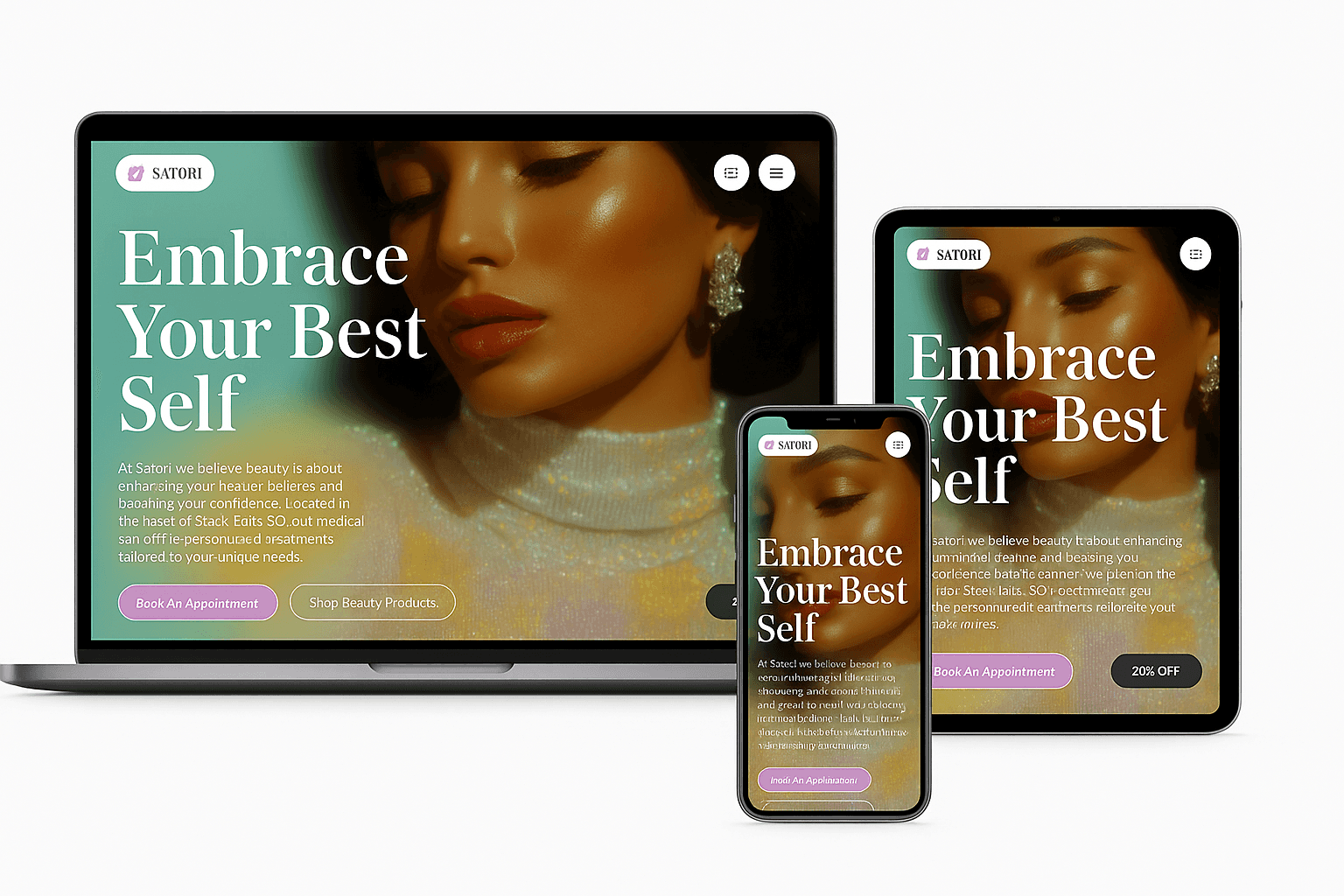
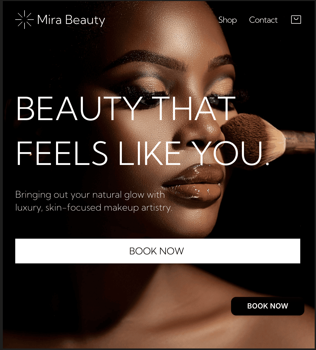
The old presence felt generic and didn’t match Mira’s level. We needed stronger identity, mobile polish, and a booking flow that felt smooth and elevated. The design had to communicate luxury without saying it.
We addressed this by using large imagery for emotional impact (Gestalt principle: figure-ground), paired with crisp typography to enhance legibility and elegance.
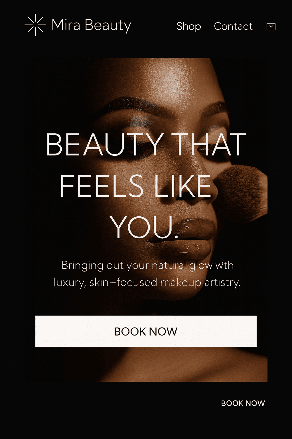
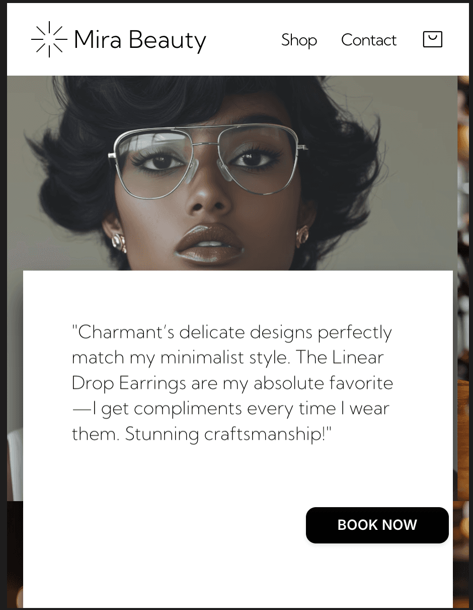
Now, Mira Beauty looks as good online as her work does in real life. Strong type, clean space, and rich visuals guide users to book confidently. High-end, high-converting, and made to grow with her brand.
Form follows function—every design choice is there to support Mira’s mission: enhancing natural beauty with excellence.
Next projects.
(2016-25©)